What can opal tap-on/tap-off data tell us?
I have been living in Sydney for the past ten years and been experiencing significant public transport improvements. The notable one is the introduction of Opal Card, a contactless fare collection system. The card makes it easier to travel, as it is acceptable in multiple transport modes.
The Transport for NSW Open Data Hub produces several open data related to Opal Card, including the Opal Trip — Train (https://opendata.transport.nsw.gov.au/dataset/opal-trips-train). I am curious whether I could use this data to answer the following questions:
- Which train line has the highest annual trips?
- What are the proportions of full, reduced and free fare trips in each of the train lines?
- What is the impact of COVID-19 on the number of trips made on the train lines?
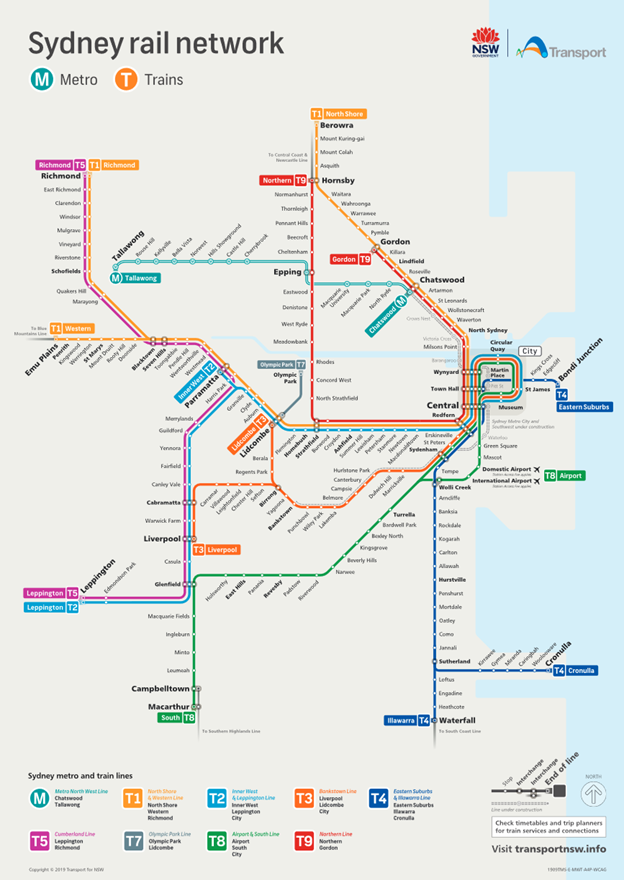
Before exploring and analysing the data, it would be good to know the Sydney Trains network. Following image shows the Sydney Trains Network Map. Currently, there are eight train lines connecting stations within the Sydney metropolitan areas.

Data Overview
The dataset contains the number of trips made using Sydney Trains, Intercity Trains, Station Link and Replacement Bus from July 2016 to November 2020. The number of travel were breakdown by the train lines, including the predecessor of the current train lines.
The dataset also contains a breakdown of trips based on the type of cards used to tap-on/tap-off. This information is useful as a proxy to differentiate the trip using full, reduced, and free fare.
Since I am only interested in the number of trips in Sydney Trains, I will be excluding the Intercity Trains, Station Link and Replacement Bus data from the analysis.
Question 1. Which train line has the highest annual trips?
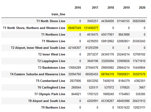
To answer this question, I aggregated data by train lines and year and applied a simple visualisation to highlight the highest number of trips.

Based on the above table, T1 North Shore, Northern and Western Line is a clear winner in 2016 and 2017.
However, in 2018 the T4 Eastern Suburbs and Illawarra Line took the lead in the highest number of trips.
This shift is due to the following changes:
- On 26 November 2017 the T1 North Shore, Northern and Western Line was redefined into T1 North Shore Line, T1 Northern Line, and T1 Western Line.
- On 26 November 2017 the T2 Airport, Inner West and South Line was split into T2 Inner West Line, T2 Leppington Line, and T8 Airport and South Line.
- On 28 April 2019, the T1 Northern Line was renamed to T9 Northern Line.
- On 5 January 2020, the T6 Carlingford Line was closed and converted to light rail.
Question 2. What are the proportions full, reduced and free fare trips in each of the train lines?
The trip data was aggregated based on three categories based on the card type used for tap-on/tap-off.
- Full fare (Adult, CTP, Day Pass without SAF, and Sgl Trip Rail Adult)
- Discounted fare (Child/Youth, Concession, Day Pass Child/Youth w/o SAF, Senior/Pensioner, and Sgl Trip Rail Child/Youth)
- Free fare (Employee, Free Travel, and School Student)

The graph above shown relatively the same pattern across all train lines, which around 75–81% of travellers paid the full fare, 15–21% paid the discounted fare and 1 to 4% travel for free.
Is the train lines serving similar demographic distribution? A combined analysis using census data may be able to answer this question.
Question 3. What is the impact of Covid-19 on the number of trips made on the train lines?
I will be focusing on examining the aggregated monthly figures from January to November 2020.

The graph above shows a distinct drop in the number of opal trips from February to April 2020. The decline in the figure is coincident with the increasing number of Covid 19 cases in NSW and the direction made by many organisation for staff to work from home.
After April 2020, NSW eases restrictions, which saw a steady increase in the number of trips.
Between July and August 2020 there was concern on a new cluster of NSW cases, which seems to cause a minor dip in the number of trips observed.
It would be interesting to see the number of trips in late December 2020 to early January 2021, where a more stringent restriction applies due to the increase of cases.
Conclusions
- Since the redefinition of T1 North Shore, Northern and Western Line, the T4 Eastern Suburbs and Illawarra have consistently recorded the highest number of the trip.
- There is a similar proportion of trips made with different fare type. Throwing other datasets into the analysis may throw exciting observation.
- Overall, the number of trips in some lines has been decreased since Covid detected in the Sydney metropolitan areas. While the number of trips has not reached the same figure as in previous years, it is interesting to see that there has been a steady number of trips made across the train lines.
Acknowledgements
The Transport for NSW Open Data Hub for providing the Opal Trip — Train and Sydney Trains Network Map.
Disclaimer
Opinions expressed are solely my own and do not express my employer or data provider’s views or opinions.
